-
Visualization tabs

-
-
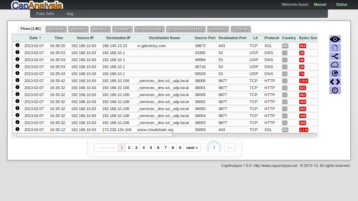
Flows
List of all streams (UDP and TCP) present in the Dataset. For each flow/stream will be indicated:
- Date and time
- Source IP
- Destiantion IP
- Hostname -destination-
- Source port
- Destiantion port
- Layer 4 protocol
- Application protocol
- Country
- Bytes sent
- Byte received
- Lost bytes Sent
- Lost bytes Received
- Packets Sent
- Packets Received
- Duration
-
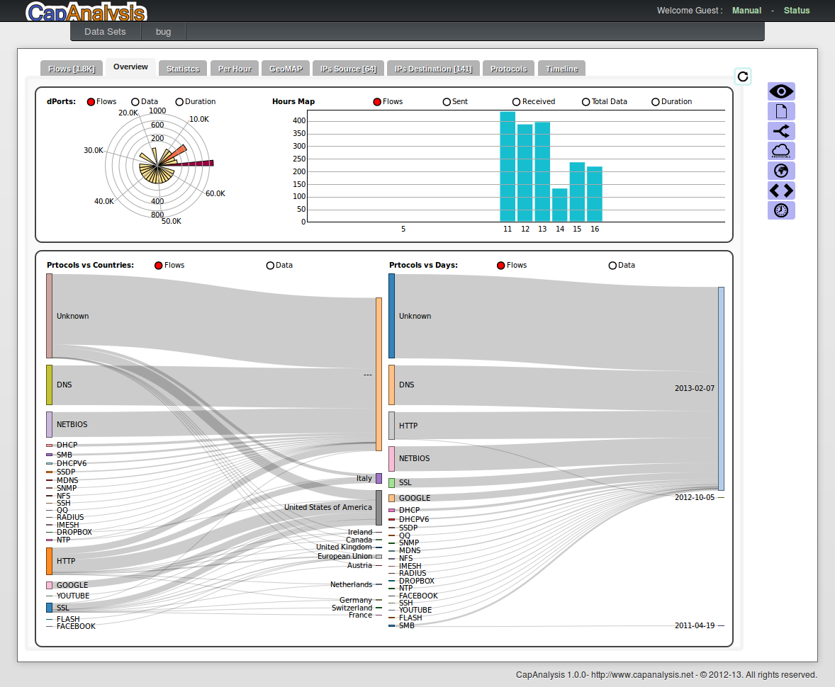
Overview
"Overview" shows the distribution of destination port used in the Dataset's flows, and also: the hourly distribution of the data, the protocol type vs the country and the protocol type vs the data (days). For each of these charts you can select (from the small menu near the chart) the visualization type.
-
-
-
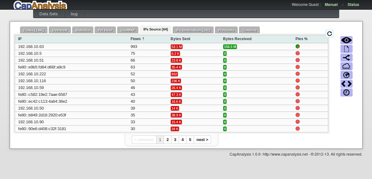
Statistics
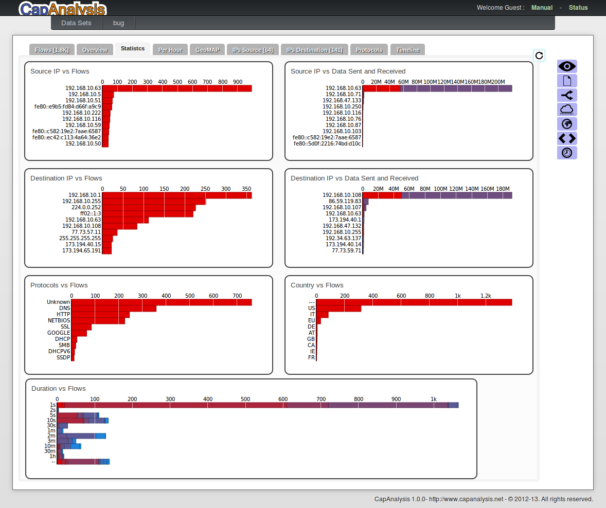
"Statistics provides detailed information and the possibility to quickly identify:
- Which IP generates the most traffic
- The most used destination IP
- The protocols being used
- The duration of the connections
-
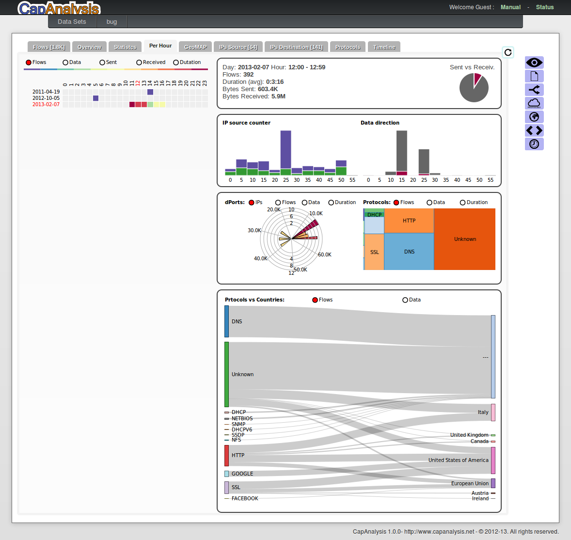
Per Hour
For each day, for each hour "Per Hour" shows:
- the data sent and received
- for every 5 minutes the number of IP sources present and the number of IP destinations contacted
- for every 5 minutes the data sent and received
- the ports destiantion used by the connections
- the protocols used vs destination countries
-
-
-
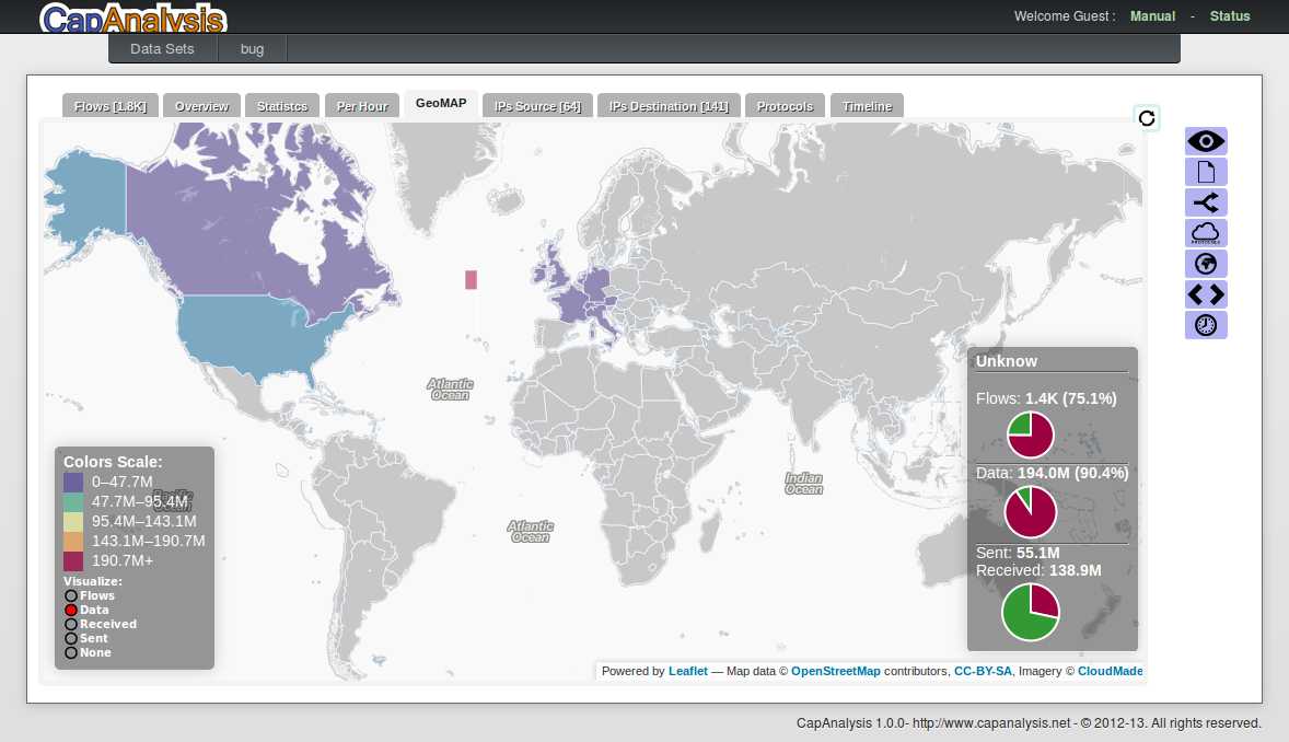
GeoMAP
A map of the world where the color of the nation identifies the level of intensity of the flows, or data received or sent data
-
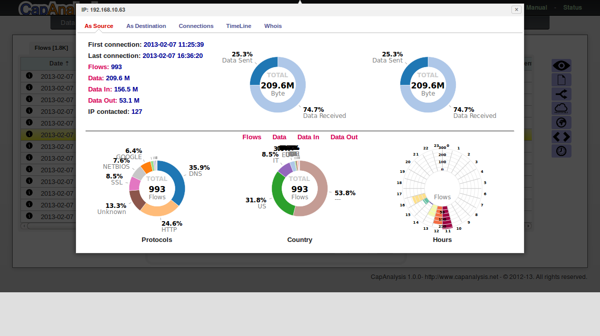
IP sources and destinations
List of all IP source/destination. Clicking on the IP you can have a detail and analysis of data related to that IP.
-
-
-
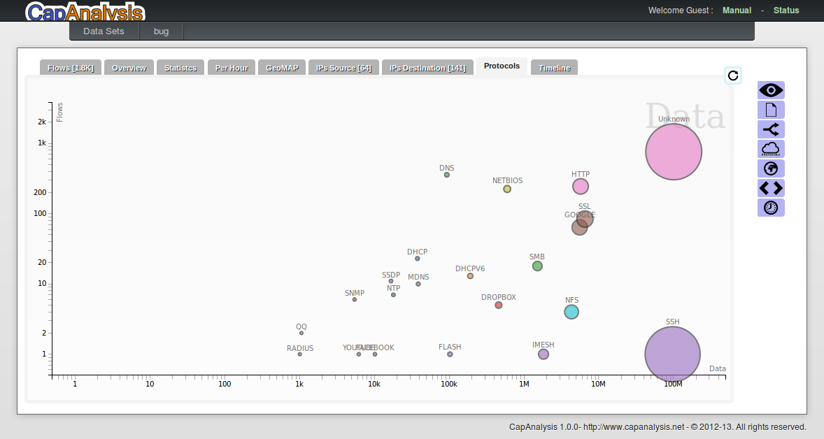
Protocols
A chart which displays data protocols based on (click on the name of the background):
- Data
- Flows
- Data Received
- Data Sent
- Data/Flow
- IP Destination
- IP Source
Clicking on the name of the axes (X, Y) it is possible to change the reference of each axis, and clicking on the protocol spot appear other informations.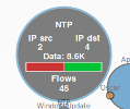
-
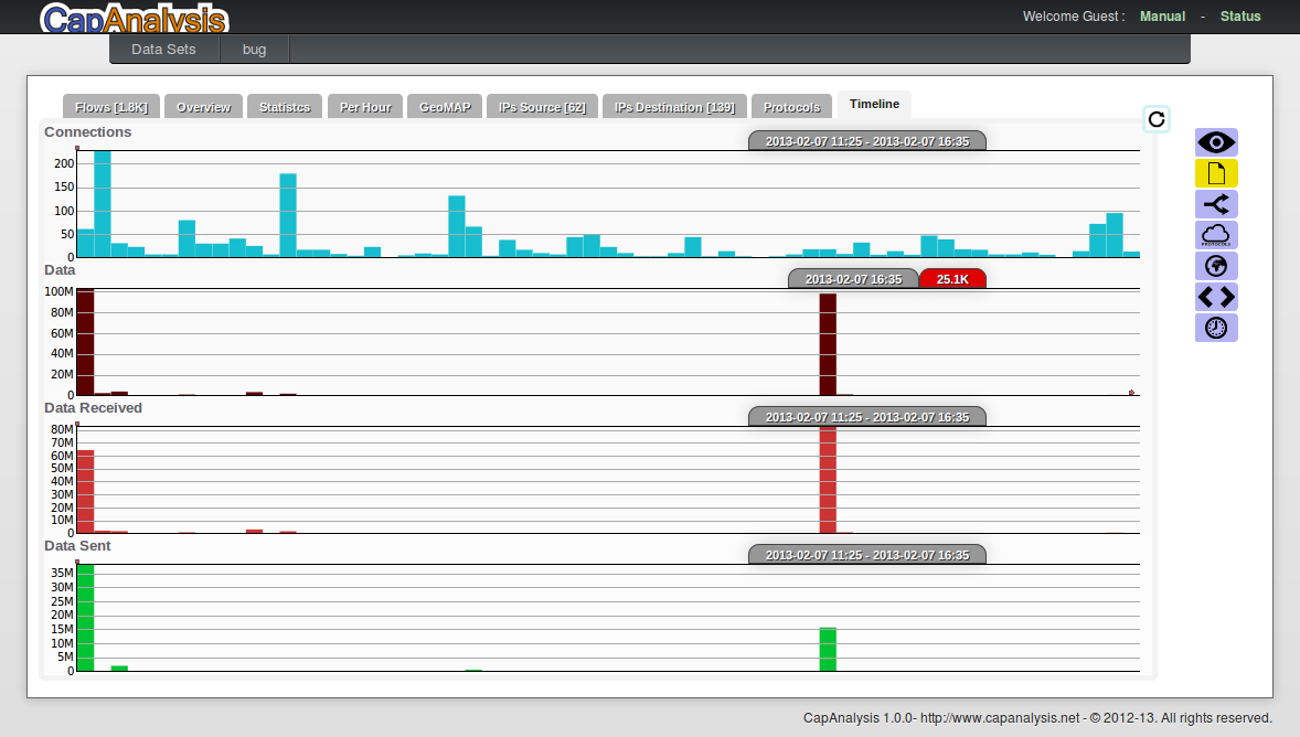
Time Line
The chats show the number of connectons, the amount of data exchanged the data sent and received.
Timeline charts have a minimal resolution of 5 minutes. -